
Colour study in red and green & collage, c-type print, 2025
I realise my last post was sent in November. The irony is, I constantly think about writing the newsletter, but as usual the fear factor kicks in. Or the other dilemma; I simply don’t like spending time by a screen. I do vow to make a change, and I hope to make these monthly, or at least every two months.
I have been spending the last few months adjusting my practice and my mind feels like a whirlwind at the moment. Since expanding my practice, it feels that so much is inspiring me, it’s hard to focus and can feel very overwhelming. Currently within my colour research I am researching ways to extract and make pigments from plant material and bringing drawing and printmaking back into my work. I do plan to share more in my newsletters in the next coming months.
I wanted to begin this month’s newsletter with my first flowers of spring. I don’t have access to a garden, being in a top floor flat in London, but I have started to add pots at the entrance, and so far no one has asked me to stop. It’s such a joy to watch my plants grow. I have my indoor plants, but being able to grow plants outdoors too has been a vital necessity for the soul.
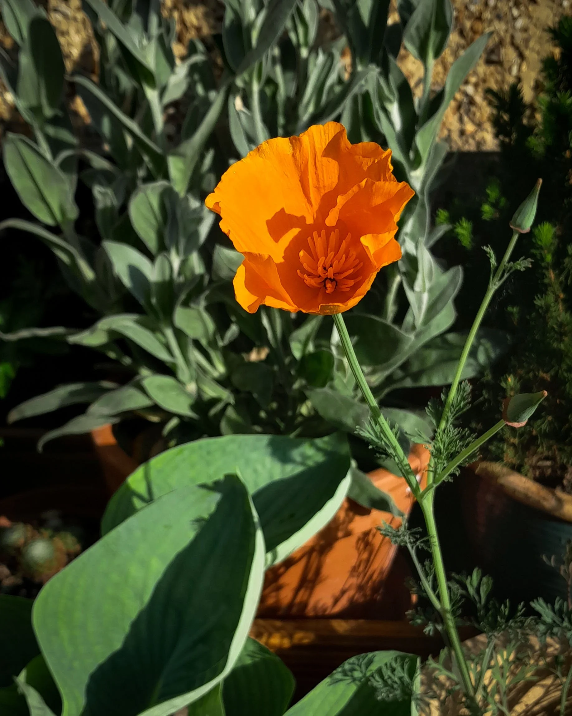
First flower of spring, California Poppy. Inspiration from Derek Jarman’s garden.

Lychnis, Rose Campion, inspiration from Derek Jarman’s garden and a cutting purchased in Dungeness. It has taken over a year to come into maturity and flower.
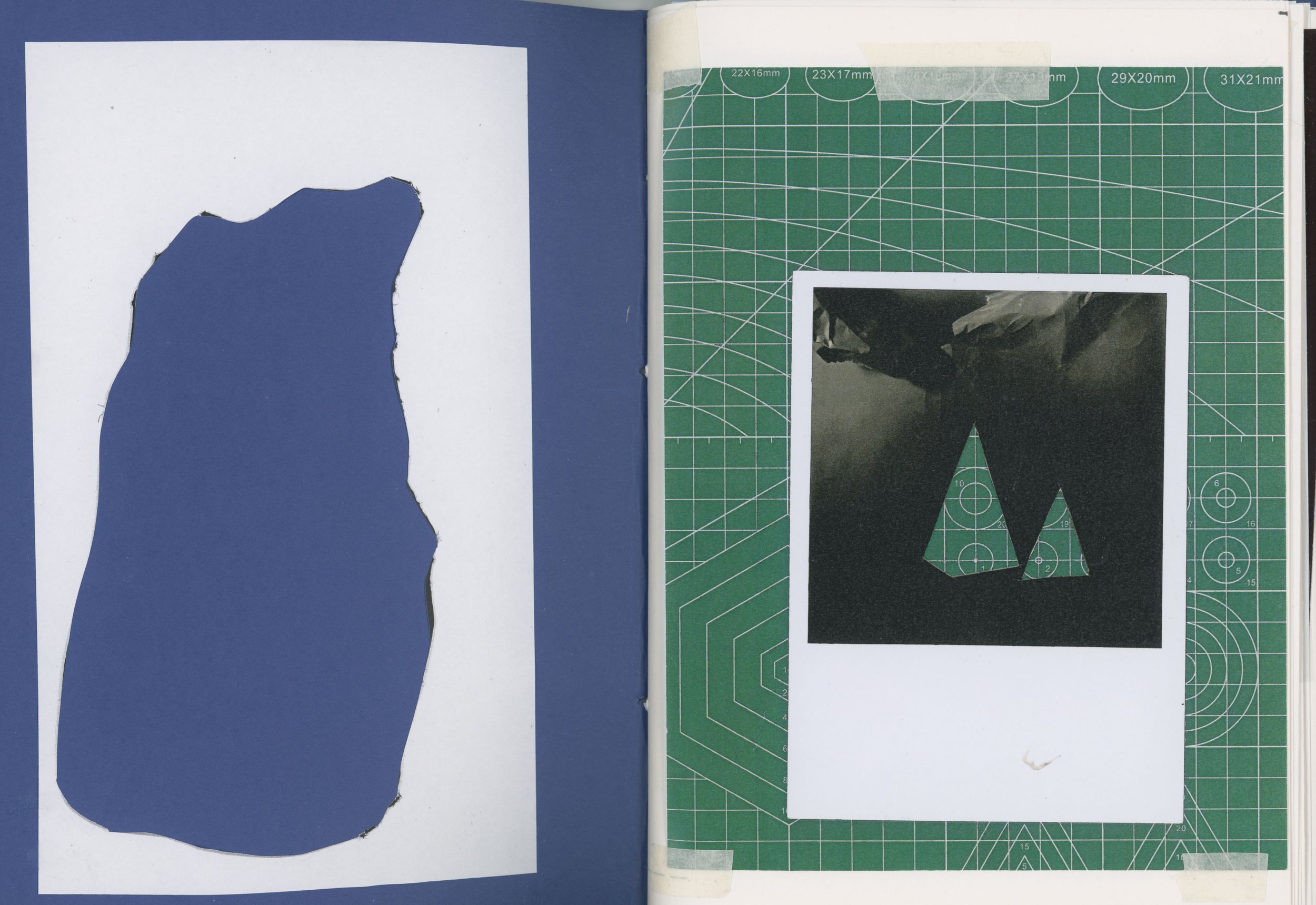
To delve back into where I finished in my last post, (read here for a recap)I was sharing my sketchbooks which showed my colour swatches created from screen printing and darkroom photography, showing a comparison between colours created from light(darkroom) and colours created from pigment(screen print). Below are two more sketchbook examples I have been working on. These generally have more written notes containing my thoughts surrounding colour or quotes gathered from books. I don’t know if anyone else suffers from having a lot of sketchbooks containing different areas of their practice, but I am finding if I have all my subject matters in one place it can be confusing, especially if I need to find a reference quickly. The downside to having more sketchbook/notebooks, is remembering that you have them and archiving! I find having my practice in a digital era hard to keep up, to do the work is one thing, but to then archive and make it digital is another feat in itself. As my research develops, I am searching for ways to categorize my work, at the moment it is overwhelming looking at the boxes of prints knowing something has to be done to get them seen. Enough of my panic talk, let’s talk about stencils.


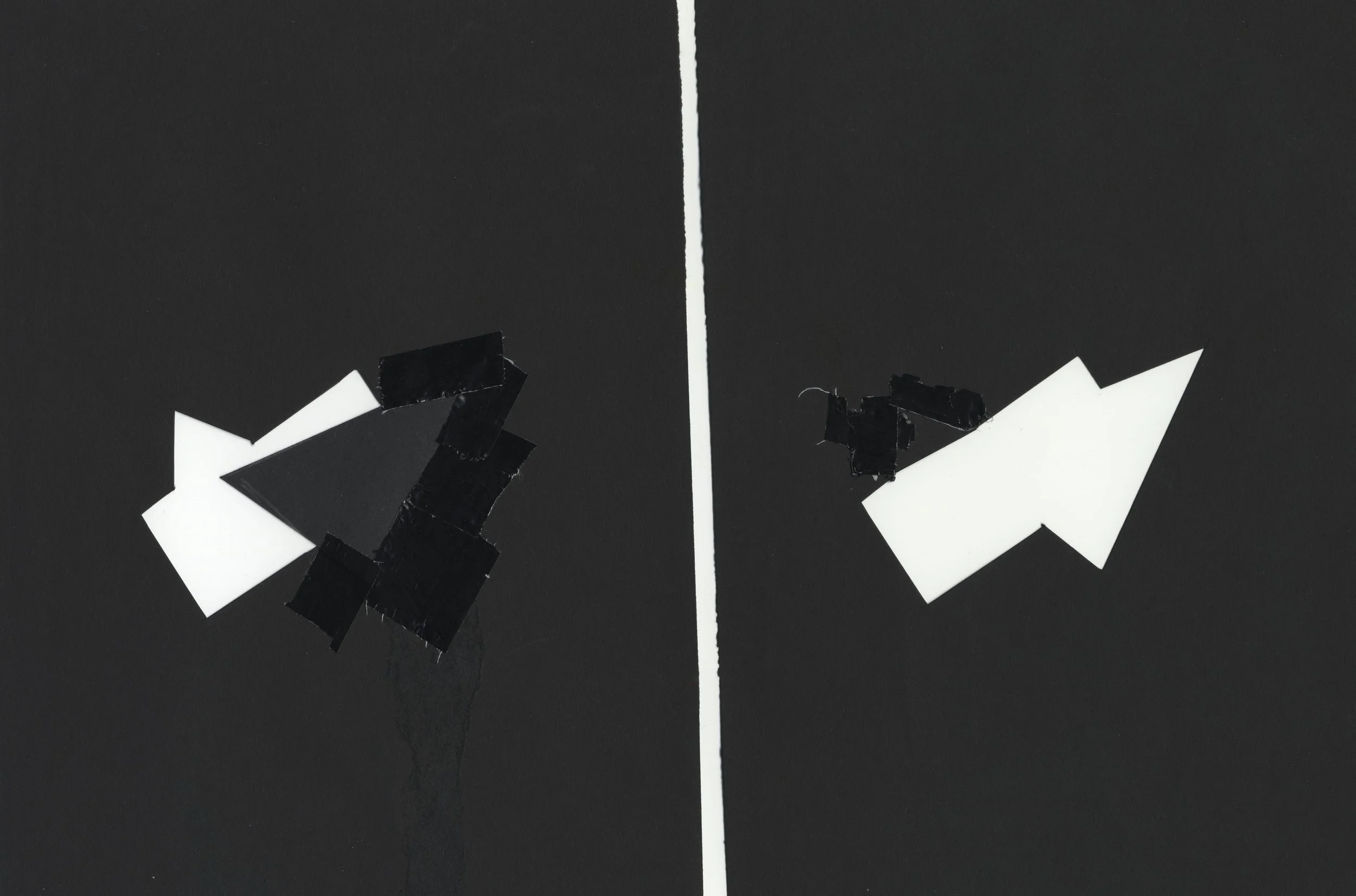
Stencils - Here are my first experimental pieces from stencils I created. All images are handprinted colour darkroom prints. No negative used.


Stencilling came about as I started to experiment with colour theory in the darkroom, I needed to find a way of controlling the light in the darkroom and replicate the results. When I began introducing screen printing into my work, it got me thinking about the possibilities of layering. I remember staring at my black and white photographs of the stones I shot during my visit to Avebury and thinking “How great would it be to replicate the shape in its basic form and emphasize this through colour?” So I began to cut up my photographs removing the basic shapes. It felt so freeing to start heading towards abstract imagery and colour in my photography. I could see the boundaries of print and photography merging.
See images below to how it started.

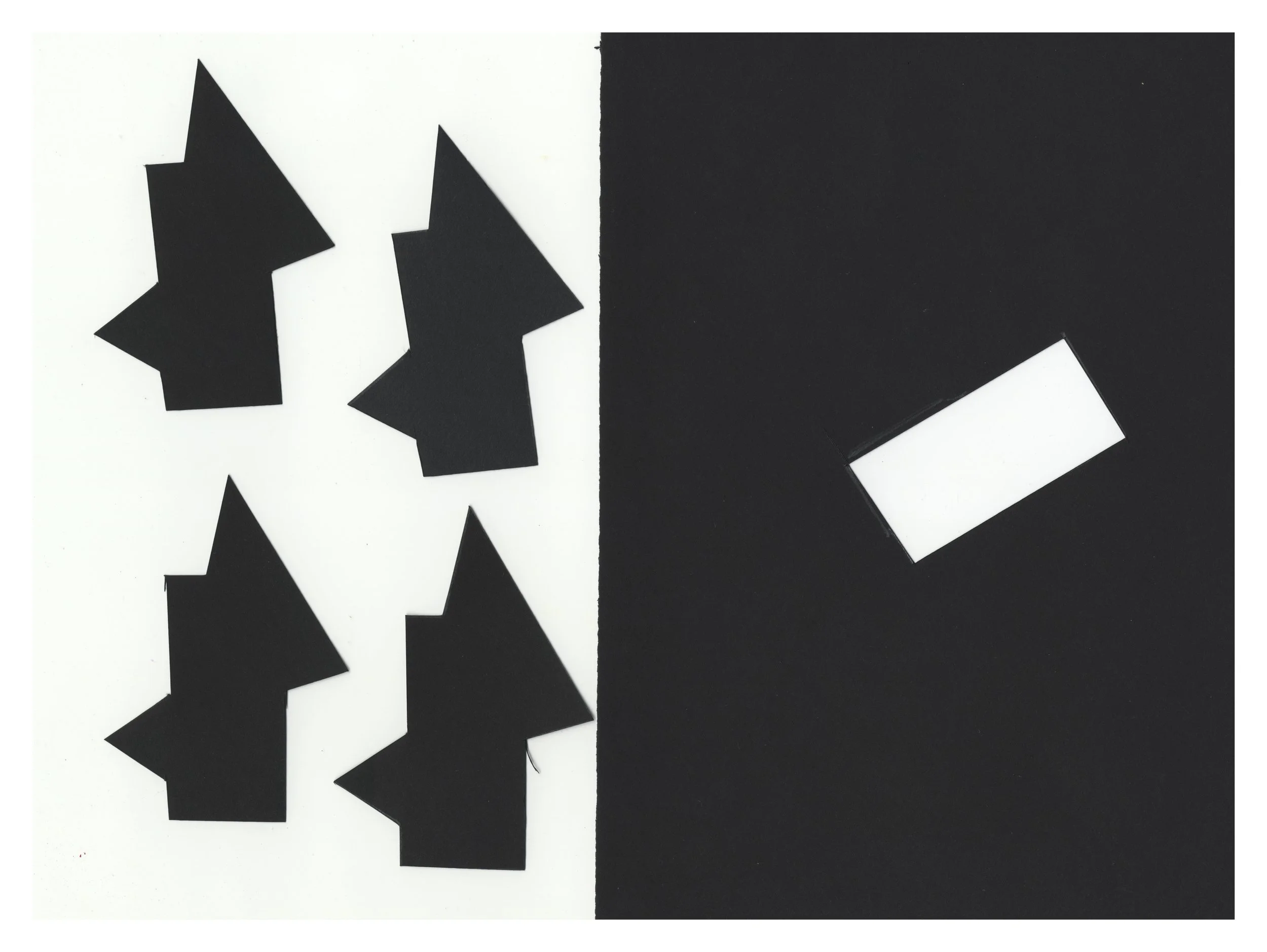
Work in progress image. In the background you can see the original photos cut out to first create the stencils. You can also see my colour swatches. Every colour is carefully selected.

The original black and white darkroom print. Taken in Avebury.

On the left is the first darkroom print with the stones removed. The first stencil created. Right is a colour darkroom print created from layers of stencils.
The cut up photographs became my maquette, which progressed to my stencils created from black card, the card stopping light travelling through the whole stencil. I started with the original size from the photograph, but then I was able to enlarge the initial shape. It was great fun to experiment with different sizes. What I had to work out though, was the order of sequence in placing the stencils onto photographic paper to achieve the correct colour. Remember, I am in the colour darkroom, everything is done in complete darkness. The colours were purposely selected through creating my own swatches and notes, allowing me to replicate the same results time and time again.
Below are some of the stencils used for the Avebury stones.


Here is another example depicting a plaster prism and coloured glass and turning into a series of stencils to create the below colour studies. First study is creating yellow and revealing what happens when the yellow overlays each other. The second study reveals the colours to make green. The off registration reveals the two overlapping colours, yellow and cyan merging together to make green.


Another sketchbook… This one revealing test ideas and compositions for future stencils.


I’ll leave it here for now, and next time I will show what other pieces I have created with stencils and share what I have recently been working on. It involves creating my own pigments, synthetically and naturally.