It’s approaching the end of July. To me it feels like summer is nearly over. The nights are already getting noticeably darker. It’s pessimistic I know, but that’s how I feel. Maybe it’s something to do with the summer solstice passing? Perhaps the earth is slowly making its way into autumn as we lag behind, planning our vacations?
In each newsletter I seem to describe the difficulty in writing. Even today I have sat down to write, and after thirty minutes of staring and thinking, I leave the desk and go outside to tend to my potted plants. I don’t have a garden, but I have reclaimed the concrete space in front of my flat. I have to be doing, rather than sitting. I have to force myself to sit and write, whereas I do love having my hands in the soil.

Rosemay, lemon balm, basil and mint.

Lavender, cranesbill geranium and euphorbia peaking through.
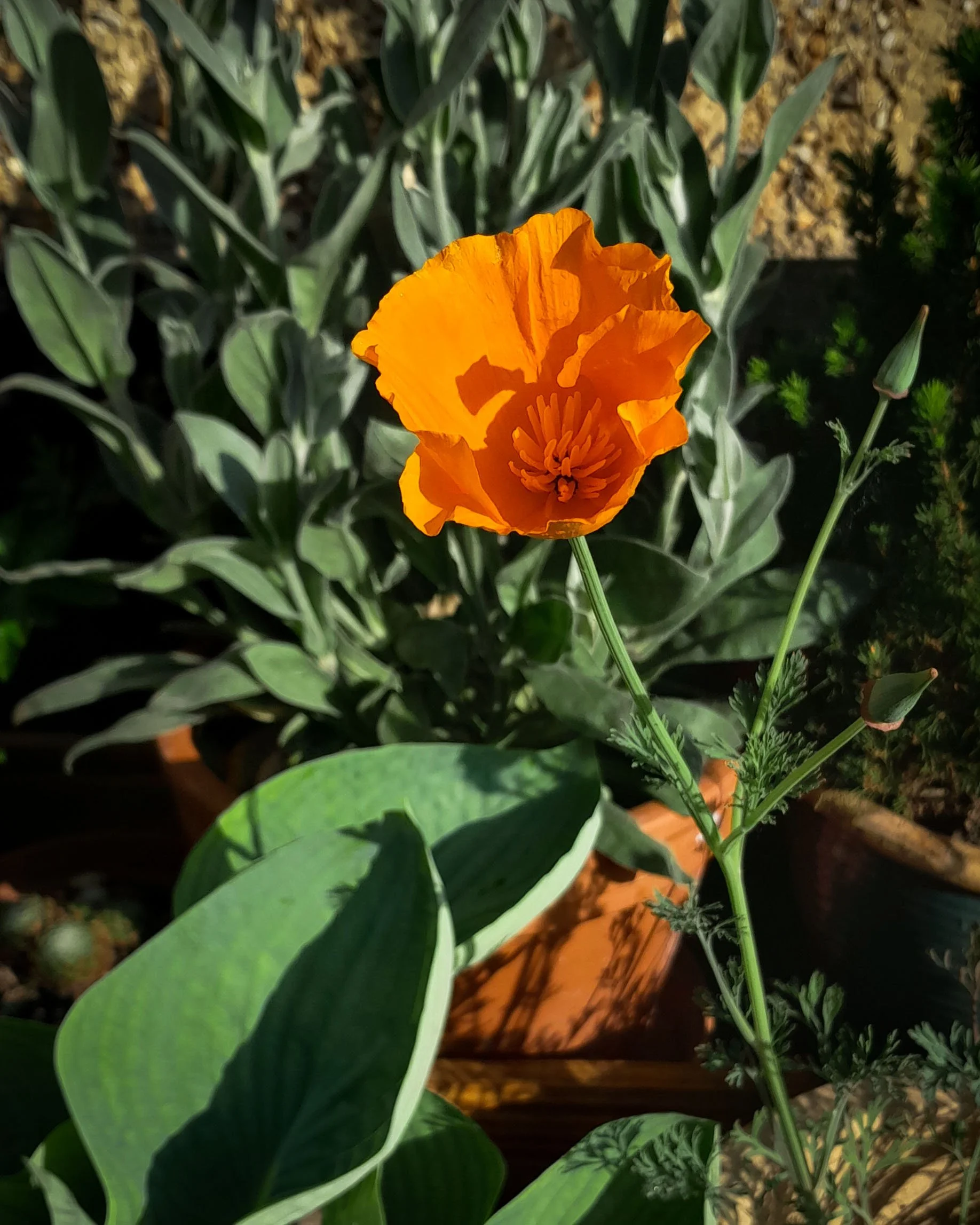
I’ve realised it’s been a year since I have started doing these newsletters, and within this time something has definitely changed in my practice, and in my way of thinking. Most of these newsletters have primarily been about colour, and I do believe that it is colour that has led me down this journey of reconnecting with nature and the land. In one of my previous posts I wrote;
“Whilst developing my research into colour and light, it has re-awakened my roots in fine art”. Due to this re-awakening I have found myself drawing, painting, and entering the world of print making. I have been trying trying to understand the nature of pigments. I’ve delved into making oil paints, printing inks and water colours, but with synthetic pigments at first. Learning about binders and mulling techniques. It’s only the beginning of this journey, but I have become completely immersed in it.


June 2025, shot on film. Revealing the process of my pigment making.
There have been moments where I thought about giving up, or wondered if I am going down the right path. And to be frank, I probably think about giving up on a weekly if not daily basis. But then I can’t think of anything else I would rather be doing. My mind comes whizzing back to thinking about colour. The excitement and desire comes flooding back. I do try and keep a journal of feelings so I can look back in moments of giving up. Here is a snippet from an entry I wrote in my notes;
'Spent four hours mulling paint, and in the end it was a failure but yet success too.
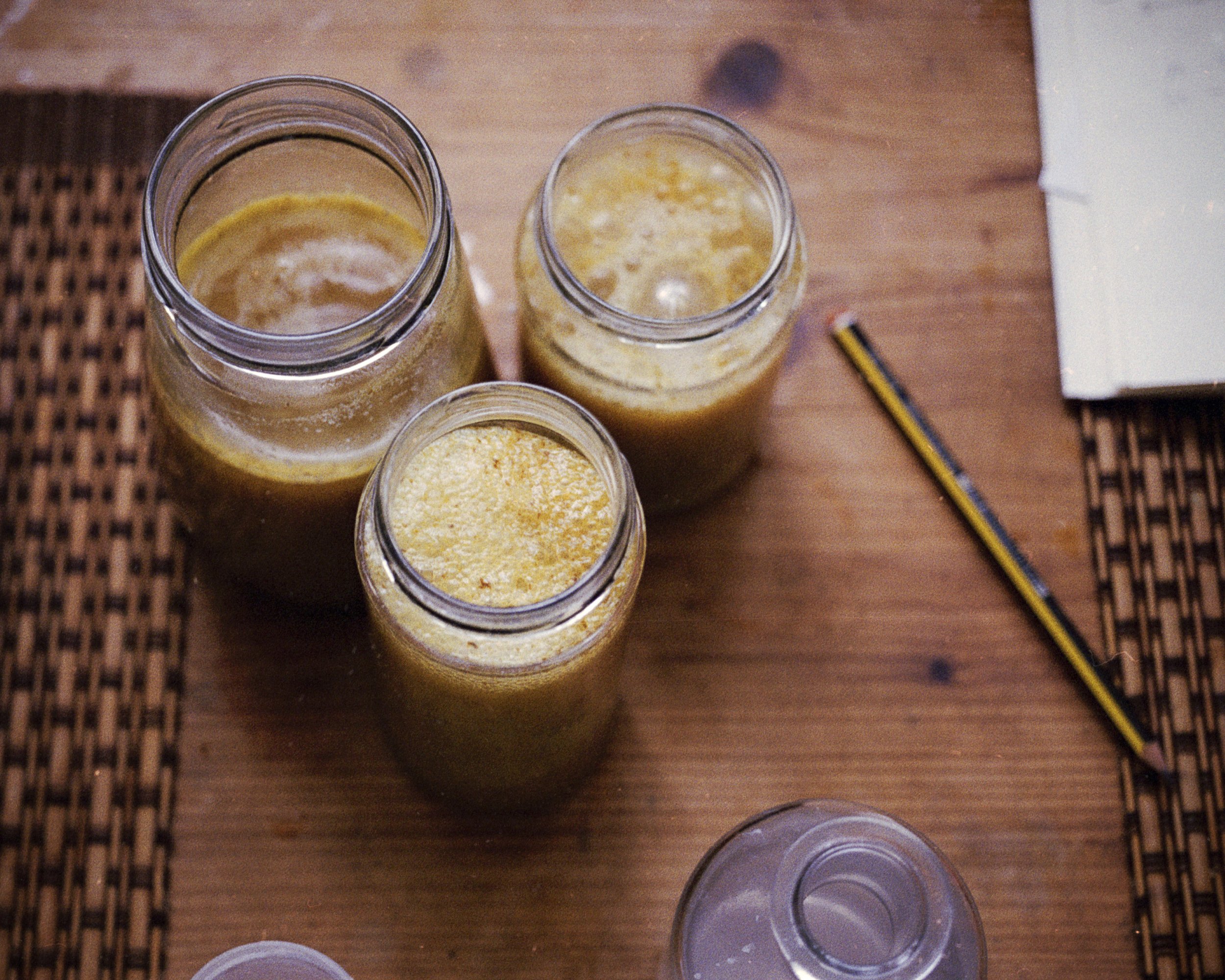
I realised my nettle pigment wasn’t opaque, so I decided to add natural chalk that I foraged. No matter how many hours I spent mulling, it still was gritty. I tried adding more copper plate oil but of course I just made it oilier and more translucent. When I tried to coat my plate for drypoint it was just a sticky mess, and the printing ink just wouldn’t hold.
In the end I realised I need to wash my chalk through a process called levigation, to enable me to get a finer grain. Then I need to add the chalk to my natural pigment to make it more opaque, find a good ratio where it doesn’t lose its colour, then slowly add the oil and hopefully I might get a better result.
I have spent a good chunk of this year researching and attempting to make pigments. It is a beautiful process, it takes time and commitment. I am not producing as much work, but hopefully this will pay off in the long run. There are times where I am not sure if I am doing the right thing. I get pulled into painting, then print, then back to photography. My mind is utter chaos at times. It can be hard to settle”.

A batch of nettle pigment, trying to get a range of tones through the same batch, by adjusting the ph levels.
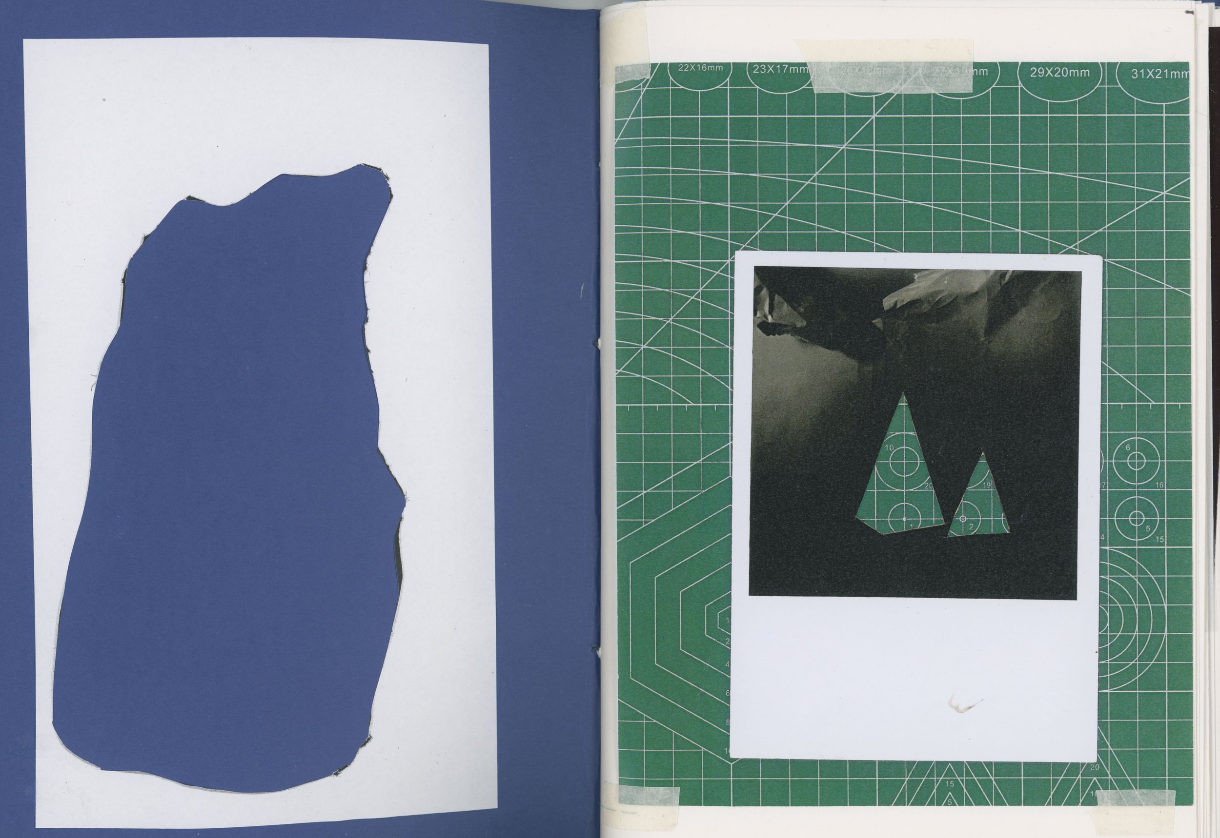
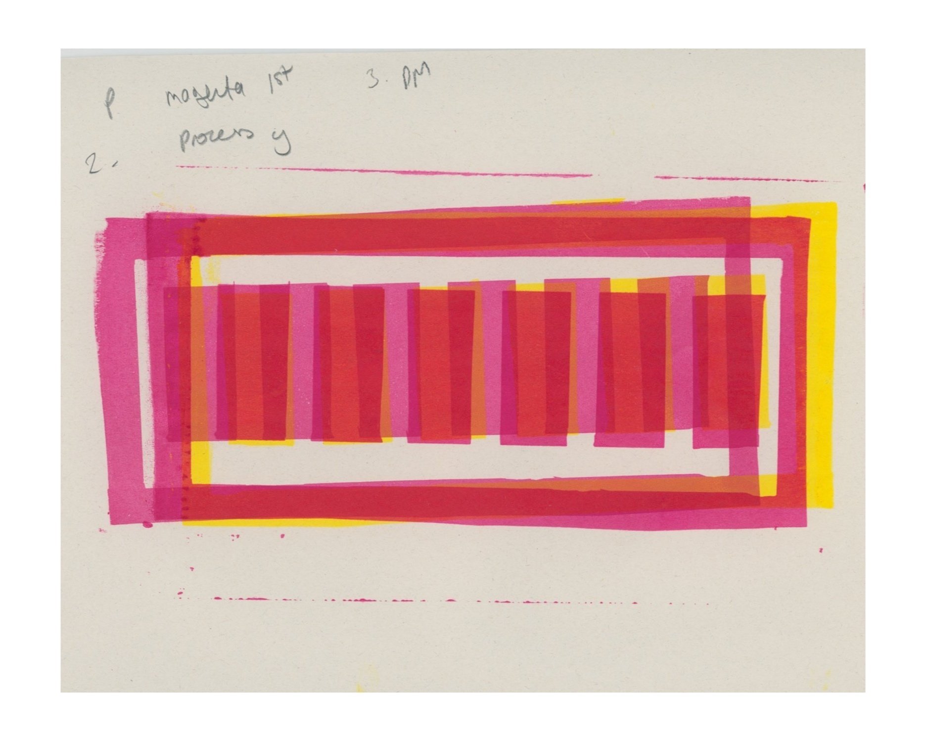
I do feel I am in a constant state of flux between colour in light and colour in pigment. And to prove this point I am going to jump back into describing my process of using stencils in the darkroom to control the mixing of colour by light. Below is an example of a darkroom print I did in homage to Joseph Albers. Between 1950 and his death in 1976, Albers titled a series of paintings ‘Homage to the Square’. These paintings reveal different colour combinations of squares consisting of three or four squares within a larger one. I wanted to recreate this but by using light instead of pigments! I started by finding out the calculations that Albers used for his squares, and began to create stencils of the different squares I would need to complete the exposure in the darkroom.


My darkroom prints below


It was really exciting to see how the colours would work against each other. It initially started off as an homage, but now, if I am trying to work out colour combinations, I actually like to use Albers’ square to test the relationship between the colours. It’s important to remember that I already have my own colour swatches ready beforehand (I spoke in more detail about how I created these swatches in the colour darkroom in my earlier posts). All I need to do is follow my own instructions to achieve the correct colour with the specific stencil.


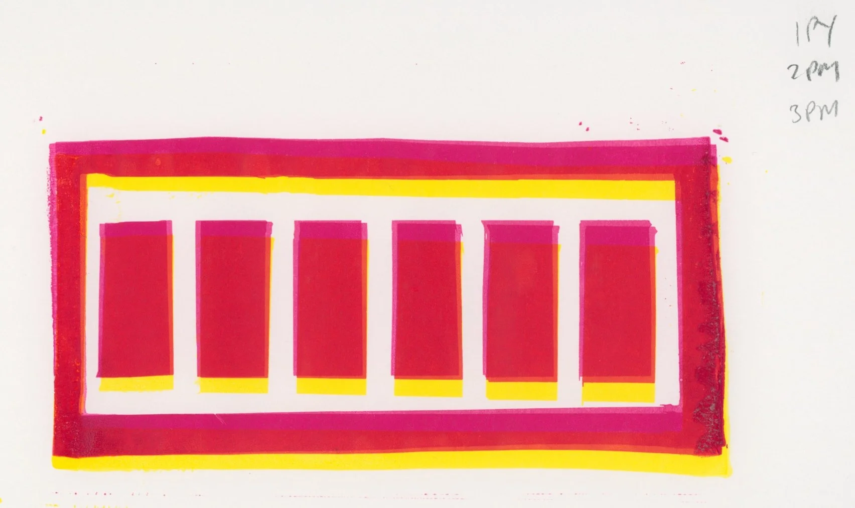
Examples of my own colour swatch books created in the colour darkroom.

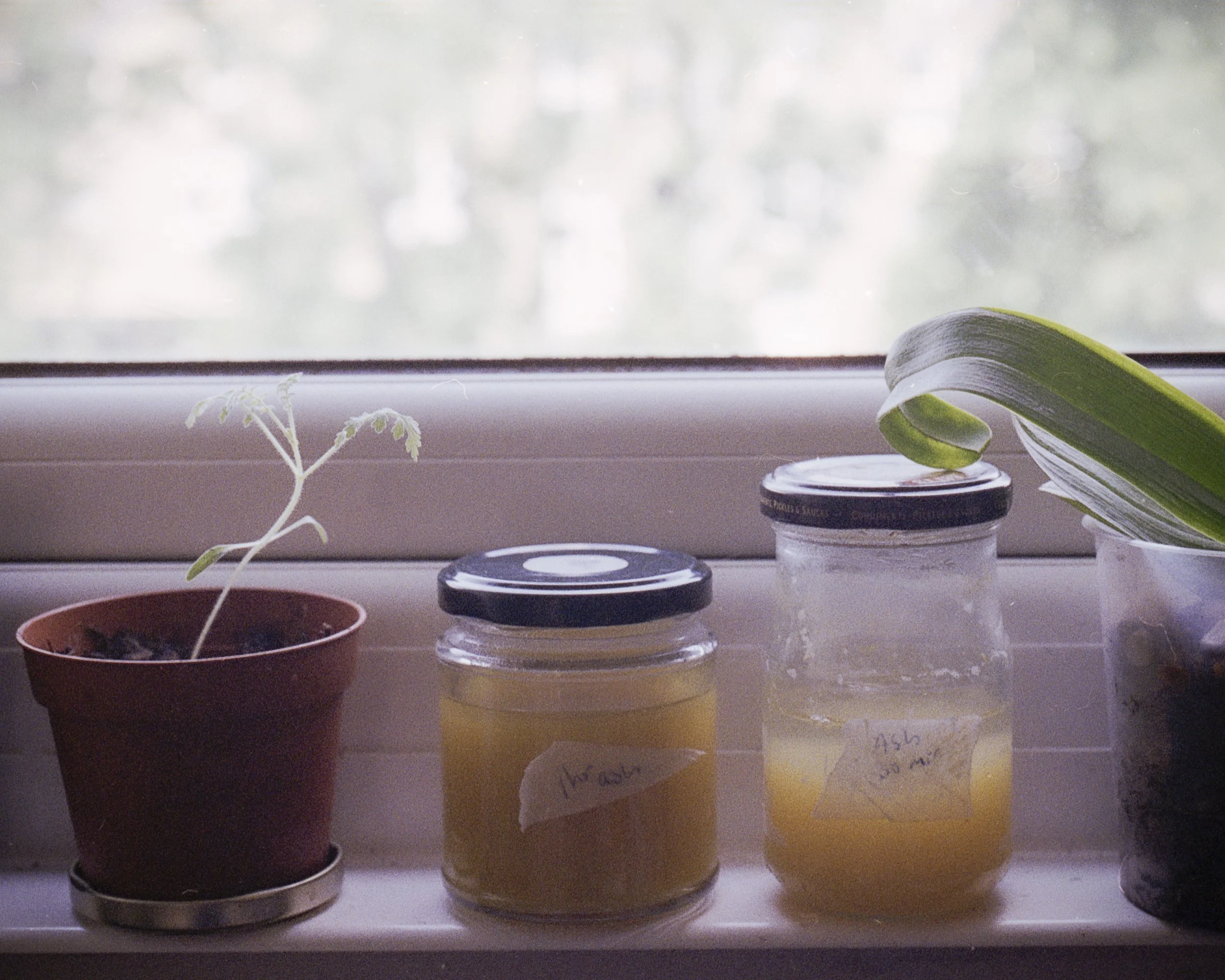
I wanted to end with this ‘in progress’ image of a chart I have started. This colour chart is a record of all the natural pigments I have created so far. For example the first row is achieving different tones with Ash tree leaves. Eventually the end idea is to cut out each square and arrange them into their own swatches.